The short answer is "no"
Hello future brides and grooms! I’m Katie, the face behind all of these blog posts. I’ve been meeting with couples and designing invitations at Fat Cat for several years. In that time some questions have come up over and over again so today I want to discuss one of those very important questions. Here it goes…. Do my invitations need to match my color palette?
Well in good news, the short answer is “no” and for those of you who want the long answer, stick around for a few minutes 🙂
Reason #1 — Style vs. Color
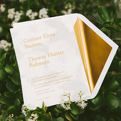
It’s more important to match the style of the wedding than a specific color. Let’s face it, your guests will not be bringing the invitation to your wedding and holding it up against your bridesmaids’ dresses. Instead, the goal of the invitation is to show your guests the style of your wedding — black tie or casual, formal or rustic, etc. Your invitation will prompt them to think about what they’ll be wearing, how to do their hair and what type of gift to give you. So if your wedding is formal with midnight blue linens but you want a rose gold invitation, go for it! Your guests will certainly understand the formal nature when they see your names pressed into the paper with shimmering foil and a gorgeous script.


Reason #2 — A Timeless Look
Maybe you’re getting married on an island and your bridesmaids are wearing hot pink, but the idea of bringing pink into your invitation feels a little too girly for you? We love pink here and don't think you can ever have too much of it, but you’re certainly allowed to disagree with us. In this case, let’s stick with something more timeless and use gold, taupe and ivory. They work well with the carefree, beachy vibe of your wedding and they won’t ever go out of style.

“Don't worry, your guests will not be bringing the invitation to your wedding and holding it up against your bridesmaids’ dresses.”
Reason #3 — Don’t Force It!
Let’s say your color palette is navy and peach. Wonderful! Those colors are really pretty BUT when you force them to sit side by side on an invitation, they don’t always play nicely. The reason these colors work well on your wedding day is that you can layer different shades and textures. The bouquets and centerpieces can be different shades of peach, coral and ivory which looks soft and beautiful against a flowing navy bridesmaid dress. That being said, when you bring navy and peach into an invitation they may not have the same effect. For instance, a peach card with navy text and a navy border can look very stark (although it could be cool for a blocky, modern invitation if that’s your style). Instead of forcing navy and peach papers to sit next to each other, I recommend either forgoing the peach and sticking to a classic navy and ivory invitation OR if you would like to keep both colors, consider bringing peach in with a floral watercolor to keep the look soft and cohesive.


Tell us!
So what’s your wedding color palette? Comment below! I’d love to hear about all the beautiful shades we’ll be seeing this season.
xoxo, Fat Cat
- Rusic Wedding Invitation Suite photographed by Brianna Wilbur
- Formal Rose Gold Invitation photographed by Fat Cat Paperie
- All Other Images photographed by Bella Figura
Work with Fat Cat from your Couch
Over-scheduled? Live out of town? Just don’t feel like changing out of your sweatpants to attend another wedding appointment? WE GET IT. We offer video consultations to make your life easier. And, it’s also a great way to work with a bunch of key family members who can’t be in the same place at the same time.


