A few more tips and tricks for you…
After such an amazing response from our first “Avoiding Paper Remorse” post, we’ve decided to put together another one! We’ve been in the business for over 10 years so we’re certainly not short on advice. Here are five more pitfalls to avoid…


1. One more seating card
Tempted to order your seating cards online? We get it, the wedding is quickly approaching and your bank account is dwindling. That $1 per card price tag may be enticing but I encourage you to think twice. First, remember that place and escort cards have a strict timeline — if you don’t have them in your hands before the wedding, you’re SOL. Second, there are often a couple of last minute changes. For instance, two of your family members just decided they can’t sit next to each other and now you have to move the tables around. Better yet, Aunt Lucy’s boyfriend has to leave town for work and now she’d like to bring her nephew because she can’t drive in the dark. If you ordered your seating cards through a big online retailer, you’ll probably have a tough time getting one or two new matching cards printed and shipped to you the day before the wedding.
2. About those fonts
By now, I can confidently say that choosing fonts is one of my favorite parts of the design process. Of course, it wasn’t always this way. I remember being in my first graphic design class thinking, “What have I gotten myself into?” Typography isn’t for the faint of heart, but after some good design courses and lots of trial and error, I’ve reached something along the lines of typeface enlightenment.
Now that being said, please don’t try this at home. Matching typefaces is tricky and one false move will make your formal invitation look tackier than a snakeskin bikini. Pretty please leave this one up to the professionals.

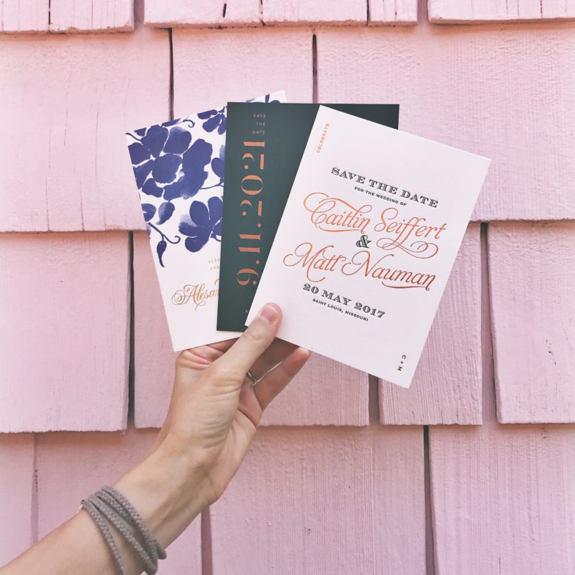
We adore these letterpress designs and it turns out you do too! The middle one in particular gets so much attention in the studios.
“Trust me when I say, legible is always best when it comes to your guests’ addresses”
3. But it’s SO pretty
I’m going to pick on that gorgeous vellum envelope with white calligraphy you have sitting on your Pinterest board. Yes, we know it looks beautiful and you have your heart set on it, but the goal is to get these babies to your guests’ mailboxes right? I have a little insider information for you. That beautiful blush envelope with silver ink combination was most likely created for a styled shoot. Practicality was probably thrown out the window. It was made to make you all googly-eyed on Pinterest but was never actually meant to go through the mail system. Trust me when I say, legible is always best when it comes to your guests’ addresses.
4. I don’t mean to blame the delivery guy, but…
Hypothetically speaking, what do you think would happen if your beautiful invitations showed up in a smashed box on your doorstep? You would probably panic. Panic would follow up with a very long phone or email correspondence trying to sort things out. In good news, we’re pretty well versed in this area. Once in a while, we’ll receive an order from the printer and the box looks exactly as previously described. Actually, it happened two weeks ago 
5. Deadlines are our business
Let’s circle back to those timelines I mentioned earlier. Before you let your sister’s friend’s aunt design your menus, keep this in mind. We’re a team of five, we have a real working studio, a hefty printer, and a fancy paper cutter. In other words, this isn’t a hobby. We’re not sweating out deadlines in our basement over a ten-year-old inkjet printer. If you order menus with us, you’ll have them in your hands before the wedding.
Missed our first post on avoiding paper remorse? Catch up here!
xoxo, Fat Cat
- Photography from Bella Figura

